
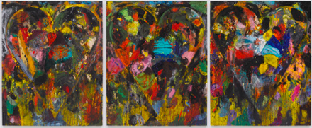
Jim Dine, The Dahlias, The Cherries, The Swiss Chard (2010). Via Pace Gallery
In ten large-scale paintings, Jim Dine’s familiar heart comes back in a new splash of color. The Pace Gallery’s show of new paintings from 2010 continues Dine’s tradition of centrally displaying the heart, and includes a 5’ x 12’ triptych titled The Dahlias, The Cherries, The Swiss Chard. Despite the continual reuse of the heart as a prominent shape in his paintings, Dine maintains integrity of the image by revisiting it with varying techniques and always a high level of attention to detail.
More text and images after the jump…
Jim Dine, October and Live Oral Vaccine (2010). Via Pace Gallery
Such extensive use of the heart runs the risk of being overly sentimental and turning viewers away, but the repetition combined with the central place the heart always holds in his works make it too bold to have the saccharine quality one would expect from such a commonly used symbol of love. In Dine’s paintings, the heart is not coy, it does not try to be clever or cute. As in October and Live Oral Vaccine, the heart shape tends to cover the entire piece, rather than taking a background role. His lack of embarrassment at using the image whenever he pleases lends a directness to its presence, and his variance in presentation over the years keeps the viewer from becoming bored with the theme.
Jim Dine, Two Big Black Hearts (1985). Via deCordova
Though traditionally an oil painter, Dine has explored the use of many different media in his heart portrayals. Previous works portraying the iconic heart have been done with watercolor, painting over photographs, and even sculptures. The sculpture Two Big Black Hearts is exactly what it sounds like: two large bronze hearts painted black. Standing prominently in the deCordova sculpture park, the 12-foot-tall hearts transform the superficial meaning of the heart into something more personal. Dine has imprinted the surface of the hearts with shapes of tools, seashells, faces, and his own handprints. His childhood memories come through in the tools, which he says represent the hardware store his grandparents owned. Though simple on the surface, the heart has gained a new meaning through Dine’s decades of meditation.
Jim Dine, Rosecrucian Interior Scene, with Lemons (2010). Via Pace Gallery
Dine’s palette inspired the new paintings at the Pace Gallery, and it is clear how their swirls of color resemble the artist’s palette. A large Plexiglas sheet smeared with mixtures of colors, the palette represents Dine’s connection to the tools an artist uses in the act of creation. These paintings are done in acrylic, which creates a texture far removed from that of oils. Using the fast drying time to his advantage, Dine sands or otherwise abrades away layers of the paint before adding more as a sort of correction to what he has already laid down. The unusual removal and layering leaves the surfaces of the works heavily textured. In a step away from his past iterations of the heart, these pieces are heavily abstracted. Varying groups of colors covering the canvasses leave the shape less prominent, though still clearly present.
-K. Heiney
Related Links:
Exhibition page [Pace Gallery]
Jim Dine: The Optimist (2004 essay) [Vincent Katz]


