

Robert Indiana, The American Gas Works (1962), Courtesy of The Whitney Museum of American Art
Robert Indiana‘s lasting fame in the canon of American post-war modernism will forever belong to his iconic LOVE sculpture—that immediately recognizable logo of stacked letters animated by it’s slanting O, which graces merchandise as ubiquitous as the US postage stamp. This beautifully simple graphic, originally conceived as a design for a Christmas Card for MoMA, has in fact so eclipsed Indiana’s expansive career that his name has become synonymous with its text. And yet this fall’s large retrospective at the Whitney, Robert Indiana: Beyond LOVE, plumbs the depths of his oeuvre to present an artist far more complex than those four well-worn letters. Curated by Barbara Haskell, the exhibit presents paintings and sculptures by the pop artist that highlight Indiana’s sociopolitical conscience as boldly as their hard-edged execution, and traces his developing formal vocabulary of language and abstraction, from biting political commentary, to personal biography, to literary allusion, Indian’s broad selection of works on view dispel any notion of the artist as one-hit-wonder. This exhibit demonstrates the thematic expanse Indiana pursues “beyond Love”, including American identity, the American Dream, and the politics of race and sexuality. Rife with literary references to American authors and indebted to artistic predecessors such as Charles Demuth, the textual program is often as radical as his post-painterly abstraction.
Robert Indiana, LOVE (1961), Courtesy of The Whitney Museum of American Art
Born Robert Clark, the artist adopted his mid-western moniker upon moving to New York in 1954. Entering an art world on the heels of Abstract Expressionism, his pop sensibilities and hard-edge style established him amongst a group of artists working in mode divorced from the New York School. Living in a former shipping warehouse in Coenties Slip, the industrial stockyard near the Brooklyn Bridge, Indiana produced works alongside artists including Ellsworth Kelly, James Rosenquist and Agnes Martin. Though his work mines everyday design and imagery, he does not consider himself a Pop Artist, but insistently claims a Hard-Edge nomination. The sharply delineated blocks of color, rendered with the crispness of industrial signs and commercial advertising, represent a great departure from the Abstract Expressionists, not to mention a formal precision derived from artists like Charles Demuth. Bold, primary colors, geometric patterning and symmetrical compositions typify his work, with popular influences heavily weighted toward the material realm of signage—words and numbers from highways to placards, whose functionality in relaying messages appealed to Indiana. His texts stem from the vernacular lexicon of postwar America – its symbolic and alphabetic languages as cultural index.
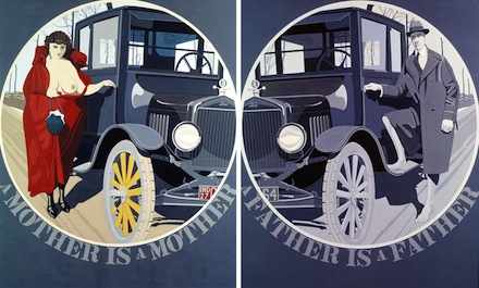
Robert Indiana, Mother and Father (1963-66), Courtesy of The Whitney Museum of American Art
Viewers are immediately greeted by one of only a few figurative paintings—a double portrait of his parents. The enigmatic diptych is split into two mirror images of his mother and father, each in a state of semi-undress. Gazing outward while stepping into a Ford Model T, (perhaps an allusion to his own origin mythology, in which he claims he was conceived in the back of a Tin Lizzie), this mysterious couple is also divided into color and black and white – his mother’s suggestively red cloak opposing a completely gray-scale father figure. The insistent epithets under the portraits, “A Mother is a Mother; A Father is a Father,” may allude to his adoptive parentage, their broken marriage, or perhaps simply communicate a more universal axiom and rigid social dialectic.
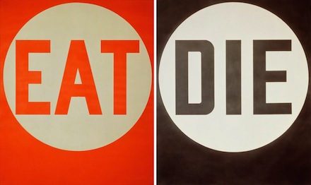
Robert Indiana, EAT/DIE (1962), Courtesy of The Whitney Museum of American Art
Indiana’s signature texts, exacted in blocky capitals originally derived from brass stencils found in his Coenties Slip loft, engage with the visual vocabulary of advertising and entertainment. The graphic content of these early paintings fulfill Indiana’s desire to send a message, exploiting the textual program for both its communicatory capacity, as well as its reflection on visual culture. Many of Indiana’s works articulate meaning through what he has called one word visual-verbal poems. The repeating textual sequence ‘Eat Love Err Hug Die’ runs throughout, the short words appearing in various combinations as an almost obsessive mantra of human mortality. Stamped in white on wooden columns, the familiar spiraling maxim is echoed on large canvases bearing these same words writ large, installed around the gallery. When not working in short, pithy statements or word-poems, Indiana excerpts lengthy passages from an American literary history. References to American authors make up much of the text in his large scale paintings, including William Carlos Williams, Hart Crane, Longfellow, Walt Whitman, and Herman Melville. Quotes from these authors are stenciled onto the large canvases in geometric patterns or embedded within schematic imagery, such as the Brooklyn Bridge. Transcribing vision to verse and back to image, Indiana’s use of text enacts a close dialogue with his artistic and literary heritage.
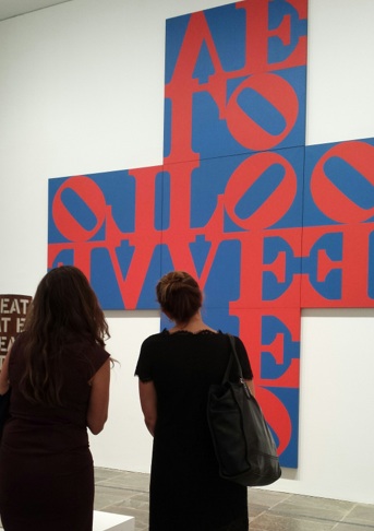
Robert Indiana, Beyond Love, Installation Shot with Love Cross (1968), Photo Courtesy of Art Observed
Included amongst his many homages to American cultural figures are one of Indiana’s most recent series, the Hartley Elegies, published in the early 1990s. Indiana considered Marsden Hartley, the modernist painter and poet, a sort of idol and inspiration, sharing in a personal history of homosexuality and great artistic achievement. Drawn from Hartley’s Portrait of a German Officer paintings from 1914-15, which document the death of Karl von Freyburg, whom Hartley loved, these prints are symbolic portraits composed of geometric patterns derived from military insignia and flags, which evoke war, love and loss with his signature hard-edged abstraction.
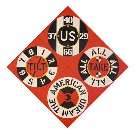
Robert Indiana, The Red Diamond American Dream #3 (1962), Courtesy of The Whitney Museum of American Art
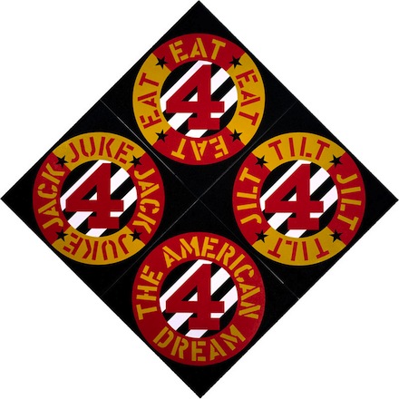
Indiana continuously returns to the thematics of the American Dream, yet his attitude towards it is hardly one note. At times he is pessimistic, even condemnatory, while other works are celebratory in tone. The Red Diamond American Dream #3 (1962) meditates on the American drive for success, winning and risk. A visual resemblance to poker chips and casino signage, and textual references to gambling with words like “Take All” or “Tilt” equate the American Dream not to chance, but to the dicey, if not doomed, fortune of a gambler. Ominous titles and hazard signs alert the viewer to the dangers of American life and culture. His portrait of Marilyn Monroe, entitled “The Metamorphosis of Norma Jean Mortenson” (1967), offers the glamor of celebrity as an allegory of self-transformation and the demands of American culture, not to mention the shifting, and deceptive, character of American identity.
Robert Indiana, The Beware-Danger American Dream #4 (1963), Courtesy of The Whitney Museum of American Art
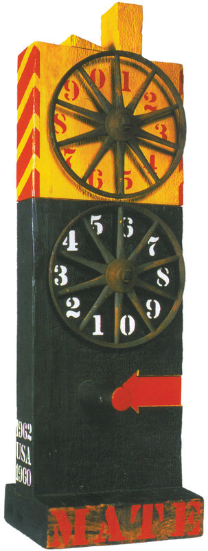
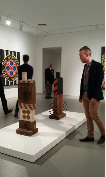
Juxtaposed against the flat, two-dimensional paintings, Indiana’s sculptures retain a certain hard-edged flatness and geometry, even in the round. These early assemblages, made of found wooden and metallic refuse, are stamped with the same painted font that graces the walls, reciting familiar words, shapes and symbols in bright colors on their raw wooden trunks. These totems, collectively titled Herms, take on an anthropomorphic presence, their wheels almost limb-like, and the unmistakably phallic protrusions a close allusion to the apotropaic Greco-Roman posts for which they are named.
Robert Indiana, Mate (1960-62), Courtesy of The Whitney Museum of American Art
A small gallery in the back features several of Indiana’s paper cut-out costume designs for Gertrude Stein’s opera ‘The Mother of Us All’, commissioned by the Santa Fe Opera in 1976. Stein and Virgil Thomson’s opera–a tribute to Susan B. Anthony—is presented as a pageant of historical figures from American history and Stein’s life. Indiana’s designs are rendered in a flat primary color scheme, intended to enliven the sets he also designed. This gallery introduces Indiana’s interest in civil rights issues; from women’s suffrage, dramatized by Stein’s paean to Susan B. Anthony, to racial violence in the United States.
Robert Indiana, Herms, Beyond LOVE, The Whitney Museum of American Art
A group of works called the ‘Confederacy Series’ locates sites of violence and civil unrest on colorful maps of US states, starring the city in which each event occurred. The same text surrounds each canvases’ distinct geographic focus, reading, ‘Just As In The Anatomy of Man, Every Nation Must Have Its Hind Parts”. The cheerful palette is subverted by the denunciatory message, a harsh judgment on the state of the union. On the opposite wall of the same gallery is a series of canvases in which the Peace Sign is deconstructed into varying incomplete versions of the forked symbol, as evidence of the political and social turbulence of both national and global events during the 1960s and 70s.
Robert Indiana, Beyond LOVE (Installation view), The Whitney Museum of American Art
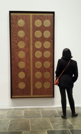
The final room is an almost reverse chronology of his developing abstraction. Featured alongside pop-looking canvases are his earliest abstract images, of gold orbs on monochromatic ground, like large scale dominoes. Immediately beside these stark geometries are Indiana’s two earliest New York pieces, Mene Mene Tekel and Upharsin, which are also the most expressionistic. Begun in 1955 and later modified with text in 1992, they feature large bulbous heads of biblical figures, executed in a thick impasto with tiny sticks jutting from its surface. They are closer to expressionism than the hard-edge geometric and graphic paintings he is known for, and remind us of the transformation in his style over a half-century long career.
Indiana’s works are on view at the museum through the beginning of next year.
Robert Indiana, Upharsin (1955-92), Photo courtesy of Art Observed
—T. Gensler
Related Links:
Exhibition Page [The Whitney Museum of American Art]
Exhibition Review [New York Times]
“Beyond Love at the Whiteney” [Wall Street Journal]
“Robert Indiana Opens Up About His First U.S. Retrospective at the Whitney Museum” [Vogue]